Mobile
Banking App.
UX/UI Design
Recognized as one of the best banking apps in Germany by CHIP Magazine
Designing a mobile banking experience focused on clarity, trust, and complex financial workflows.
For three years, I designed and evolved a large-scale mobile banking application supporting everyday financial activities such as transactions, account management, and budgeting across Android, Windows Phone, and tablet devices.
I was responsible for the UX and UI design of the Android and Windows Phone applications, shaping key features, user journeys, and interaction patterns across both platforms. I also contributed to the iOS experience, collaborating with the team to ensure consistency while respecting platform-specific guidelines and behaviors.
I translated complex financial processes into clear, reliable user experiences, helping users complete critical tasks efficiently and with confidence.
Working in an Agile Scrum environment, I collaborated closely with developers and a cross-functional team from Cologne Intelligence, balancing user needs with technical constraints and driving features from concept to implementation.
Throughout the project, I focused on simplifying workflows, improving information architecture, and creating intuitive, predictable experiences across multiple mobile platforms.
View Full Recommendation Letter
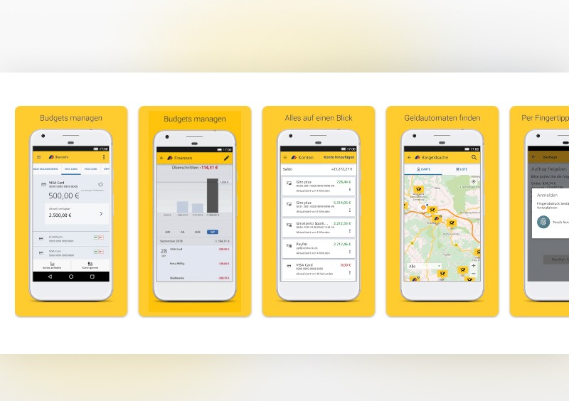
The interface follows Android Material Design guidelines relevant at the time, focusing on consistency, usability, and alignment with platform conventions.
FINANCIAL UX EXPLORATION
Designing a modern account top-up experience. A cross-platform UX exploration for iOS and Android.
While the original banking applications I worked on cannot be publicly shared, these explorations build on my experience designing mobile banking products and demonstrate how I would approach similar financial workflows today.
iOS EXPLORATION
Exploring a native iOS account top-up experience.
This concept explores how an instant account top-up flow could be designed today using native iOS interaction patterns and contemporary fintech UX practices.
The flow is informed by Apple Human Interface Guidelines, accessibility principles, and established banking conventions. The goal was to create an experience that feels familiar, efficient, and trustworthy while reducing friction during a common financial task.
Particular attention was given to information hierarchy, progressive disclosure, and payment confirmation, helping users complete the action quickly while maintaining confidence and control throughout the process.
PROBLEM
Adding money to an account is one of the most common actions in digital banking. While the task itself is simple, users need reassurance that their money is being transferred securely, clear visibility into what is happening, and confidence that they are making the right decision before confirming a transaction.
The challenge was to design a flow that balances speed with transparency, minimizes cognitive load, and reduces the risk of mistakes without introducing unnecessary friction.
SOLUTION
I designed a streamlined account top-up experience that combines familiar iOS interaction patterns with fintech-specific UX conventions commonly used in modern banking applications.
The flow guides users through:
selecting a funding method
entering an amount
reviewing transaction details
confirming with Apple Pay and Face ID
receiving immediate transaction feedback
Rather than optimizing purely for speed, the experience focuses on helping users understand where their money is coming from, where it is going, and what will happen next.
DESIGN DECISIONS
Progressive disclosure
Information is revealed gradually throughout the flow, allowing users to focus on one decision at a time and reducing cognitive load during a financial transaction.
Trust and transparency
A dedicated review step gives users the opportunity to verify transaction details before authorizing payment. This approach introduces a small amount of friction intentionally, helping prevent errors and increasing confidence.
Native where it matters
The experience relies on familiar iOS patterns such as sheets, Apple Pay, and Face ID to reduce learning effort and leverage existing user trust. At the same time, selected interaction patterns were adapted to align with common fintech expectations and financial workflows.
Fintech-oriented feedback
The success state provides immediate confirmation that the transaction has been initiated and updates the account context accordingly. Rather than focusing solely on platform conventions, feedback patterns were designed to support the level of reassurance users typically expect when moving money.

ANDROID ADAPTATION
Adapting the experience for Android with Material 3.
While the core user goal remains unchanged, the Android version was redesigned to align with Material 3 principles, Android navigation patterns, and platform-specific user expectations.
Rather than translating the iOS experience directly, the flow was adapted to reflect how Android users interact with sheets, navigation, system payment services, and transactional feedback.
The design combines Material 3 foundations with established fintech interaction patterns, balancing platform consistency with the clarity and reassurance expected in financial products.
KEY ADAPTATIONS
Bottom sheet–driven navigation
Android users are familiar with bottom sheets as a primary interaction pattern. The flow uses sheets to progressively reveal information and reduce context switching while keeping users anchored to the current task.
Material 3 hierarchy and structure
Layout, grouping, and information hierarchy were adapted to follow Material 3 principles, creating a more native Android experience while maintaining consistency with the overall product.
Platform-native payments
The payment step relies on Google Pay and biometric authentication, leveraging familiar Android system patterns and reducing friction during confirmation.
Fintech-focused feedback
While Material 3 provided the foundation, selected interaction patterns were intentionally adapted to match user expectations commonly found in modern banking and fintech applications, particularly around account status, transaction visibility, and payment confirmation.
The result is an experience that feels native to Android while preserving the trust, transparency, and efficiency required for moving money.

REFLECTION
One of the most interesting aspects of this project was exploring the tension between platform guidelines and product conventions.
Both Apple Human Interface Guidelines and Material 3 provide strong foundations for designing mobile experiences. However, financial products introduce additional requirements around trust, reassurance, transparency, and transaction visibility that sometimes call for patterns beyond the platform defaults.
By adapting the same account top-up journey for both iOS and Android, I explored how native platform behaviors can coexist with established fintech UX practices. The result is a set of experiences designed to feel native to each platform while supporting the clarity and confidence users expect when managing their money.
NEXT STEPS
This concept is based on UX best practices, platform guidelines, and experience designing financial products. However, several assumptions would need to be validated through user research and usability testing.
Assumptions to validate
Users clearly understand the difference between a completed deposit and a deposit that is still being processed.
The review step increases confidence without creating unnecessary friction.
The platform-specific adaptations maintain a consistent mental model across iOS and Android.
Success metrics
Task completion rate
Time to complete a top-up
Error rate during review and confirmation
User confidence ratings after completing the transaction
Perceived ease of use